
Web components Mode Integration
@rootauth/web-components provides framework-independent custom elements for login, registration, password reset, and post-login MFA.
Preparation
Create an application in the RootAuth Console and copy the app_id (format: app_******).
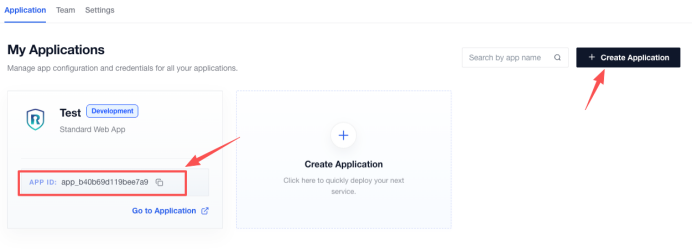
Please add the following configuration line to the .npmrc file in the project root directory:
@rootauth:registry=http://gitlab.standard-software.co/api/v4/projects/12421/packages/npm/1. Installation
pnpm add @rootauth/web-componentsYou can also use npm:
npm install @rootauth/web-components2. Initialization
The initialization function registers four RootAuth custom elements with fixed rootauth-* tag names and accepts their shared global config.
import { defineRootAuthWebComponents } from '@rootauth/web-components'

defineRootAuthWebComponents({
  config: {
    app_id: 'your-app-id',
    api_base_url: 'https://rootauth-api.rootauth.com',
    redirect_uri: window.location.origin,
    scope: ['openid'],
    locale: 'en-US',
  },
})
config is a required global initialization option shared by the login, registration, password-reset, and MFA components. Styles are bundled into the Web Components Shadow DOM and message layer. Do not import @rootauth/web-components/style.css. Registration is idempotent.
| Element | Purpose |
|---|---|
<rootauth-login> |
Login |
<rootauth-register> |
Registration |
<rootauth-reset-password> |
Password reset |
<rootauth-mfa> |
Post-login MFA |
3. Minimal example
The minimal integration declares <rootauth-login> and listens for success and error events in JavaScript. API configuration is already supplied globally during initialization rather than per element.
<rootauth-login type="email-password"></rootauth-login>const login = document.querySelector('rootauth-login')!
login.addEventListener('success', event => {
console.log('Login succeeded', event.detail.data, event.detail.values)
})
login.addEventListener('error', event => {
console.error(event.detail.message, event.detail.error)
})config.app_id is required. config.api_base_url defaults to https://rootauth-api.rootauth.com.
4. Component parameters
Mount components as HTML tags. Simple values can be declared on the tag; assign objects, arrays, boolean maps, and functions after selecting the component. Do not set locale per component. Every component uses the shared initialization value from config.locale.
4.1 Parameters
| Parameter | Type | Default | Description |
|---|---|---|---|
type |
Element-specific enum | Element default | Selects the login, registration, reset, or MFA form type |
submit-text |
string |
Localized default | Submit button text |
size |
large | default | small |
default |
Default input and button size |
input-size |
large | default | small |
Value of size |
Input size override |
button-size |
large | default | small |
Value of size |
Button size override |
required-marks |
boolean |
false |
Displays all required marks without changing validation |
show-remember-password |
boolean |
false |
Login element only |
<rootauth-login
  type="email-code"
  size="large"
  input-size="default"
  button-size="large"
  required-marks
  submit-text="Continue"
></rootauth-login><rootauth-login
type="email-code"
submit-text="Continue"
size="large"
input-size="default"
button-size="large"
required-marks
show-remember-password
></rootauth-login>FieldKey is email, username, phone, password, newPassword, confirmPassword, code, mfaEmail, mfaPhone, mfaCode, or mfaSecondaryCode.
Object and function options fieldLabels, requiredMarks, fieldIcons, fieldPlaceholders, and beforeSubmit are assigned as element properties rather than HTML tag attributes.
Invalid login, registration, reset, size, or MFA values fall back to the element default. An invalid global config.locale falls back to zh-CN.
4.2 Customize field appearance
Field appearance is configured through fieldIcons and fieldPlaceholders. fieldIcons can disable icons globally for an element or customize selected fields, while fieldPlaceholders overrides input and calling-code search placeholders.
Set fieldIcons to true to show the current built-in default icons, or false to hide every leading field icon in the current element. In object mode, keys use FieldKey: true selects the default icon, false hides that field icon, an image URL replaces it, and omitted fields retain their built-in icons. Relative URLs, absolute URLs, Data URLs, and SVG Data URLs are supported. The URL is rendered in an <img>; arbitrary HTML is not executed.
fieldPlaceholders supports every FieldKey plus phoneCodeSearch, which controls the search input inside the calling-code dropdown.
<rootauth-login id="styled-login" type="email-password"></rootauth-login>

<script type="module">
  const login = document.querySelector('#styled-login')
  login.fieldIcons = { email: false, password: '/assets/password-icon.svg' }
  login.fieldPlaceholders = { email: 'Enter your work email', password: 'Enter your password' }
</script>
4.3 CSS Shadow Parts
Stable internal structures expose standard part names. Application CSS can use element::part(name) to style Shadow DOM content without depending on internal .rootauth-wc-* classes.
| Part | Target |
|---|---|
form |
Form root |
field |
Individual field container |
label, required-mark |
Field label and required mark |
control, control-error, control-disabled |
Input control and its error or disabled state |
input, icon, input-action |
Input, leading icon, and clear/password visibility action |
error |
Field error message |
phone-code-trigger |
Calling-code dropdown trigger |
phone-code-dropdown, phone-code-search, phone-code-option |
Calling-code dropdown, search input, and option |
code-row, code-button |
Verification-code row and send button |
submit-button, submit-loading |
Submit button and loading state |
remember-password, remember-password-checkbox |
Remember-password area and checkbox |
agreement, agreement-error |
Registration agreement and unconfirmed error state |
totp-container, totp-qrcode, totp-secret |
TOTP setup area, QR code, and manual secret |
rootauth-login::part(control) {
  border-radius: 8px;
  background: #fff;
}

rootauth-login::part(input) {
  font-family: Inter, sans-serif;
}

rootauth-login::part(submit-button) {
  border: 0;
  border-radius: 8px;
  background: #111827;
  font-weight: 600;
}

rootauth-login::part(control-error) {
  box-shadow: 0 0 0 1px #dc2626 inset;
}
::part() cannot select descendants of a part, so ::part(control) input is invalid; use ::part(input) directly. Global notifications live in document light DOM and can be styled with ordinary CSS through .rootauth-wc-global-message-host .rootauth-wc-message.
5. config
config is passed to defineRootAuthWebComponents() and shared by login, registration, password-reset, and MFA elements. This section lists API, OIDC, loading, message, and TOTP-copy options.
config is the required global initialization option passed to defineRootAuthWebComponents({ config }). Its type, RootAuthElementConfig, extends RootAuthClientConfig. Every RootAuth element shares this configuration, so do not assign config to each element separately.
| Option | Type | Default | Purpose in Web Components |
|---|---|---|---|
app_id |
string |
None | Required application ID and request header value |
api_base_url |
string |
https://rootauth-api.rootauth.com |
API base URL |
redirect_uri |
string |
window.location.origin |
Login and registration redirect URI |
scope |
string[] |
['openid'] |
OIDC scopes |
state |
string |
None | OIDC state |
grant_type |
string |
authorization_code |
Authorization grant type |
locale |
string |
zh-CN |
Shared UI and request language for every component |
message |
RootAuthMessageConfig |
{} |
Global message configuration |
show_submit_loading |
boolean |
false |
Shows loading in submit buttons; hosted mode sets true |
defineRootAuthWebComponents({
  config: {
    app_id: 'your-app-id',
    api_base_url: 'https://api.example',
    locale: 'en-US',
    message: { duration: 5000 },
    show_submit_loading: true,
  },
})
The Web Components config documentation intentionally exposes only applicable client settings. It does not list logo_url, base_path, onLoginSuccess, onRegisterSuccess, or enable_google_one_tap.
5.1 message
interface RootAuthMessageConfig {
  colors?: Partial<Record<'primary' | 'success' | 'warning' | 'info' | 'error', string>>
  duration?: number
  show_error?: boolean
}
colors defaults to built-in colors. duration defaults to 5000 milliseconds; values <= 0 disable automatic dismissal. show_error defaults to true; setting it to false hides default error messages while preserving error events.
defineRootAuthWebComponents({
  config: { message: { colors: { error: '#f00' }, duration: 3000, show_error: true } },
})
6. Login element
<rootauth-login> renders email, phone, or username login according to type and handles codes, password encryption, validation, and MFA events. This section maps every login type to API parameters.
Element: <rootauth-login>. Class: RootAuthLoginElement.
6.1 type
type |
Login method | Fields | API type |
|---|---|---|---|
email-password |
Email and password | email, password |
EMAIL_PASS |
phone-password |
Phone and password | phoneCode, phoneNum, password |
PHONE_PASS |
username-password |
Username and password | username, password |
USER_NAME_PASS |
email-code |
Email and verification code | email, code |
EMAIL_CODE |
phone-code |
Phone and verification code | phoneCode, phoneNum, code |
PHONE_CODE |
The default is email-password. Code-based forms emit code-sent after a code is sent. Phone calling codes come from the application configuration returned by the API.
<rootauth-login type="email-password" submit-text="Sign in" show-remember-password></rootauth-login>6.2 Remember password
showRememberPassword controls whether password-login forms display a Remember password checkbox and defaults to false. It applies only to email-password, phone-password, and username-password; code login forms never display it.
<rootauth-login type="email-password" show-remember-password></rootauth-login>login.showRememberPassword = trueWhen selected, the element encrypts the current login type, account, and original password in localStorage after the login API succeeds. A later element with the same login type restores the values and checkbox state. A successful login with the checkbox cleared removes the saved record. An MFA-required response also saves the values because the first authentication factor has succeeded.
Local encryption prevents cleartext storage but cannot protect credentials from XSS that can execute in the page. Enable this feature only on trusted pages and enforce a strict CSP.
7. Registration element
<rootauth-register> renders email, phone, or username registration according to type. It applies server password rules, verification codes, and user agreements; this section lists every registration type.
Element: <rootauth-register>. Class: RootAuthRegisterElement.
7.1 type
type |
Registration method | Fields | API type |
|---|---|---|---|
email-code-password |
Email code and password | email, code, password |
EMAIL_CODE_PASS |
phone-code-password |
Phone code and password | phoneCode, phoneNum, code, password |
PHONE_CODE_PASS |
username-password |
Username and password | username, password |
USER_NAME_PASS |
The default is email-code-password. Passwords are RSA-encrypted before requests. Agreement visibility, content, and required confirmation come from the application configuration API; there is no agreementVisible property.
<rootauth-register type="email-code-password" submit-text="Register"></rootauth-register>8. Password-reset element
<rootauth-reset-password> supports email or phone code-based password recovery and validates and encrypts the new password before submission. This section describes the fields for both types.
Element: <rootauth-reset-password>. Class: RootAuthResetPasswordElement.
8.1 type
type |
Reset method | Fields | API type |
|---|---|---|---|
email |
Email code reset | email, code, password, password_confirmation |
EMAIL_CODE |
phone |
Phone code reset | phoneCode, phoneNum, code, password, password_confirmation |
PHONE_CODE |
The default is email. Both password values are RSA-encrypted and checked for equality.
<rootauth-reset-password type="email" submit-text="Reset password"></rootauth-reset-password>9. MFA element
<rootauth-mfa> handles email, phone, and TOTP verification, including first-time authenticator binding. It consumes MFA data returned by login; this section explains its parameters, type selection, and account mapping.
Element: <rootauth-mfa>. Class: RootAuthMfaElement.
9.1 Parameters
| Parameter | Type | Default | Description |
|---|---|---|---|
type |
otp | phone | email |
otp |
MFA page type |
mfaType |
MfaMethod | undefined |
Inferred from type |
Exact API mfa_type |
mfaToken |
string |
'' |
Required mfa_token returned by login |
email |
string |
'' |
Known email; makes the field read-only |
phoneCode |
string |
'' |
Known calling code |
phoneNum |
string |
'' |
Known phone; makes the field read-only |
phoneMask |
string |
'' |
Masked phone display; makes the field read-only |
phoneAllowCodes |
string[] |
['86'] |
Allowed calling codes |
totpSecret |
string |
'' |
TOTP secret or complete otpauth:// URI |
totpBindNeedVerifyCode |
boolean |
false |
Requires email or phone verification before TOTP binding |
mfaTotpText |
MfaTotpTextConfig |
{} |
TOTP setup copy |
totpSetupHint |
string |
'' |
QR setup hint |
totpManualEntryHint |
string |
'' |
Manual-secret hint |
totpScanProblemText |
string |
'' |
Cannot-scan action text |
totpScanQrCodeText |
string |
'' |
Show-QR action text |
mfaCodePlaceholder |
string |
'' |
MFA code placeholder |
<rootauth-mfa
  type="otp"
  mfa-type="TOTP_BIND"
  mfa-token="mfa_token_value"
  email="user@example.com"
  phone-code="86"
  phone-num="13800138000"
  phone-mask="138****8000"
  phone-allow-codes="86,852"
  totp-secret="JBSWY3DPEHPK3PXP"
  totp-bind-need-verify-code
  totp-setup-hint="Scan QR code"
  totp-manual-entry-hint="Enter secret"
  totp-scan-problem-text="Cannot scan"
  totp-scan-qr-code-text="Show QR code"
  mfa-code-placeholder="Enter code"
></rootauth-mfa><rootauth-mfa
type="otp"
mfa-totp-text='{"setup_hint":"Scan with your authenticator","manual_entry_hint":"Enter the secret manually","scan_problem":"Cannot scan the QR code","scan_qr_code":"Return to the QR code"}'
></rootauth-mfa>mfaTotpText belongs only to <rootauth-mfa> and must not be passed to defineRootAuthWebComponents({ config }).
9.2 Complete mfaType list
mfaType |
Method | code contains |
Additional parameters |
|---|---|---|---|
EMAIL |
Verify bound email | Email code | Optional known email |
EMAIL_BIND |
Bind and verify email | Email code | email |
PHONE_CODE |
Verify bound phone | SMS code | phoneCode, phoneNum, or phoneMask |
PHONE_CODE_BIND |
Bind and verify phone | SMS code | phoneCode, phoneNum |
TOTP |
Verify bound authenticator | Authenticator code | None |
TOTP_BIND |
Bind an authenticator | Authenticator code | totpSecret; account code when totpBindNeedVerifyCode=true |
<rootauth-mfa type="otp" mfa-type="TOTP_BIND"></rootauth-mfa>When mfaType is absent, phone maps to PHONE_CODE, email to EMAIL, and otp to TOTP.
For type="otp", email or phone verification is shown only when totpBindNeedVerifyCode=true. Pass the login response's totp_bind_need_verify_code value directly; when false, the element neither renders nor submits totp_bind_code.
The login element derives loginAccountType and totpAccountName from the selected login method and associates them with mfa_token. Applications do not set these values on the MFA element.
<rootauth-mfa
  type="otp"
  mfa-type="TOTP_BIND"
  mfa-token="mfa_token_value"
  email="user@example.com"
  totp-secret="JBSWY3DPEHPK3PXP"
  totp-bind-need-verify-code
></rootauth-mfa>
When type="otp", totpBindNeedVerifyCode is true, and the login MFA response contains both email and a phone value (phone_num or phone_num_mask), the OTP binding account row displays a switch button. With only one bound channel, that channel is used without a switch. Direct email and phone MFA views never display this switch.
MFA values from the login response can be mapped directly to tag attributes:
<rootauth-mfa
  type="otp"
  mfa-type="TOTP_BIND"
  mfa-token="mfa_token_value"
  email="user@example.com"
  phone-code="86"
  phone-num="13800138000"
  phone-mask="138****8000"
  totp-secret="JBSWY3DPEHPK3PXP"
  totp-bind-need-verify-code
></rootauth-mfa>
10. Public method
Public methods let application code update form state without accessing Shadow DOM. The current setValues() method can restore accounts, calling codes, and other field values.
10.1 setValues(values)
setValues(values: Record<string, string | number | boolean | null | undefined>): voidsetValues() updates multiple fields and rerenders. null and undefined are ignored; other values become strings. One value-change event is emitted.
login.setValues({
  email: 'user@example.com',
  password: 'Password1',
})| Element | Common field names |
|---|---|
| Login | email, phoneCode, phoneNum, username, password, code |
| Registration | email, phoneCode, phoneNum, username, password, code |
| Password reset | email, phoneCode, phoneNum, password, password_confirmation, code |
| MFA | email, phoneCode, phoneNum, code, bindCode |
11. Events
Elements emit DOM CustomEvents for success, errors, code delivery, field changes, MFA requirements, and secret copying.
Every custom event uses bubbles: true and composed: true, so it can be observed on the element or an ancestor.
11.1 success
Emitted when login, registration, password reset, or MFA succeeds.
interface RootAuthSuccessDetail {
  source: 'login' | 'register' | 'reset-password' | 'mfa'
  data?:
    | CustomerLoginResponse
    | RegisterWithCaptchaResponse
    | LoginSuccessData
    | Record<string, never>
  values: Record<string, string>
}
11.2 error
Emitted when a request, code delivery, or configuration operation fails.
interface RootAuthErrorDetail {
  source: 'login' | 'register' | 'reset-password' | 'mfa'
  error: unknown
  message: string
}
11.3 code-sent
Emitted after an email, phone, or MFA verification code is sent. The send button then uses verify_code_resend_interval_seconds from application configuration for its countdown, falling back to 60 seconds when missing or invalid.
If the error message Too many incorrect verification code attempts. Please request a new code. appears when requesting a verification code, go to Console > General Security > CAPTCHA Rules > CAPTCHA Attempt Count to check whether the configured limit meets your requirements.
interface RootAuthCodeSentDetail {
  source: 'login' | 'register' | 'reset-password' | 'mfa'
  target: 'email' | 'phone'
  values: Record<string, string>
}
11.4 value-change
Emitted after field input, clearing, calling-code selection, or setValues().
interface RootAuthValueChangeDetail {
  source: 'login' | 'register' | 'reset-password' | 'mfa'
  values: Record<string, string>
}
11.5 mfa-required
Emitted by the login element when login succeeds but the backend requires MFA. In this case, success is not emitted.
interface RootAuthMfaRequiredDetail {
  data: CustomerLoginResponse
  loginAccountType: 'EMAIL' | 'PHONE' | 'USERNAME'
  values: Record<string, string>
}
data usually contains mfa_token, mfa_methods, email, email_mask, phone_code, phone_num, phone_num_mask, and totp_secret. loginAccountType is explicitly derived from the login element's current type.
11.6 totp-secret-copied
Emitted after the user copies the TOTP secret in manual-entry mode.
interface RootAuthTotpSecretCopiedDetail {
  source: 'mfa'
  secret: string
}
12. Slots
Slots insert application content around account controls and submit buttons while preserving component layout and request behavior. Place content inside the RootAuth tag and set slot="slot-name"; no Shadow DOM access or JavaScript node creation is required.
| Slot | Position | Elements |
|---|---|---|
before-submit |
Before submit | Login, registration |
after-submit |
After submit | Login, registration, password reset |
account-suffix |
Right of account control | Code login, password reset, TOTP email/phone verification |
- Use
before-submitfor forgot-password links and related actions. - Use
after-submitfor agreements, registration entries, or flow notes. account-suffixshares the account input row. When MFA needs its built-in verification switch, the component gives the built-in control priority.
<rootauth-login type="email-code">
  <button slot="account-suffix" type="button">Switch account type</button>
  <a slot="before-submit" href="/help">Cannot sign in?</a>
</rootauth-login><rootauth-mfa type="otp" totp-bind-need-verify-code>
<button slot="account-suffix" type="button">Switch verification method</button>
</rootauth-mfa>An element that does not expose a named slot ignores that position. The host page remains responsible for clicks, navigation, and application state inside slot content.
13. Requests, validation, and navigation
Elements read server application configuration for captcha, password rules, calling codes, and agreements, then emit consistent success or error events. This section defines preprocessing, navigation boundaries, and style encapsulation.
- Tencent CAPTCHA runs automatically according to the application configuration returned by the API.
- Passwords are encrypted with
pass_trans_rsa_public_keybefore login, registration, and reset requests. - Login, registration, and MFA login success redirect after one second when
redirect_urlis returned. successanderrorare cancelable. Callevent.preventDefault()to override the default redirect or error message.- Error messages are mounted at the top of
document.bodyand remain visible when the source element is removed, until dismissed or expired. Setmessage.show_errortofalseto disable them. - Each component fetches and caches application configuration automatically.
- Calling codes, username rules, user agreements, RSA keys, and CAPTCHA settings from application configuration participate in rendering or validation.
- Shadow DOM styles are bundled; application code does not import a stylesheet.
14. TypeScript exports
The package exports types for initialization, element properties, field maps, event details, and flow enums. This section lists the TypeScript types available for application integrations.
import type {
  RootAuthElementConfig,
  RootAuthFieldIcon,
  RootAuthFieldIcons,
  RootAuthFieldLabels,
  RootAuthFieldPlaceholders,
  RootAuthPlaceholderKey,
  RootAuthLoginType,
  RootAuthLoginElementProps,
  RootAuthRegisterType,
  RootAuthResetPasswordType,
  RootAuthMfaType,
  RootAuthMfaElementProps,
  RootAuthRegisterElementProps,
  RootAuthSuccessDetail,
  RootAuthErrorDetail,
  RootAuthCodeSentDetail,
  RootAuthMfaRequiredDetail,
  RootAuthValueChangeDetail,
} from '@rootauth/web-components'
15. Complete initialization example
The complete example combines global API options, sizing, labels, icons, placeholders, a pre-submit hook, and component event handling as a reusable integration template.
<rootauth-login id="rootauth-login" type="email-password"></rootauth-login>
<rootauth-mfa type="otp" mfa-token="mfa_token_value"></rootauth-mfa>import { defineRootAuthWebComponents, type RootAuthElementConfig } from '@rootauth/web-components'
const config: RootAuthElementConfig = {
app_id: 'your-app-id',
api_base_url: 'https://rootauth-api.rootauth.com',
redirect_uri: window.location.origin,
scope: ['openid'],
state: 'your-state',
locale: 'en-US',
message: {
duration: 5000,
colors: { success: '#16a34a', error: '#dc2626' },
},
show_submit_loading: false,
}
defineRootAuthWebComponents({ config })
const login = document.querySelector('rootauth-login')!
login.requiredMarks = true
login.fieldLabels = { email: 'Work email', password: 'Account password' }
login.fieldIcons = { email: false, password: '/assets/password-icon.svg' }
login.fieldPlaceholders = { email: 'Enter your work email' }
login.showRememberPassword = true
login.beforeSubmit = async () => true
login.addEventListener('success', event => {
console.log('Flow succeeded', event.detail)
})
login.addEventListener('error', event => {
console.error('Flow failed', event.detail.message)
})16. Related Modes
@rootauth/core: UI-free API@rootauth/vue: complete Vue 3 hosted authentication pages@rootauth/react: complete React 18+ hosted authentication pages
;}.cls-2{fill:%230868f7;}.cls-3{fill:url(%23未命名的渐变_44);}.cls-4{fill:%23333;}%3c/style%3e%3clinearGradient%20id='未命名的渐变_8'%20x1='33.73'%20y1='100.61'%20x2='-0.03'%20y2='-1.06'%20gradientUnits='userSpaceOnUse'%3e%3cstop%20offset='0'%20stop-color='%237ae9fb'/%3e%3cstop%20offset='0.67'%20stop-color='%232b90f8'/%3e%3cstop%20offset='1'%20stop-color='%230868f7'/%3e%3c/linearGradient%3e%3clinearGradient%20id='未命名的渐变_44'%20x1='27.86'%20y1='18.67'%20x2='68.36'%20y2='22.22'%20gradientUnits='userSpaceOnUse'%3e%3cstop%20offset='0'%20stop-color='%235ac7f2'/%3e%3cstop%20offset='1'%20stop-color='%230868f7'/%3e%3c/linearGradient%3e%3c/defs%3e%3cpath%20class='cls-1'%20d='M29,28.74V81.91l-9.51-3.68v0L8.52,74A7.17,7.17,0,0,1,4,67.32V24.54A3.76,3.76,0,0,1,9.08,21Z'/%3e%3cpath%20class='cls-2'%20d='M68.09,78.07a13.15,13.15,0,0,1-17.9,12.06L29,81.91h0V28.74L50.19,37A13.17,13.17,0,0,0,68.08,25.3h0Z'/%3e%3cpath%20class='cls-3'%20d='M68.08,25.3a13.19,13.19,0,0,1-6.73,10.87A13.09,13.09,0,0,1,50.19,37L29,28.74V6A3.76,3.76,0,0,1,34.1,2.52l25.59,9.91A13.22,13.22,0,0,1,68.08,25.3Z'/%3e%3cpath%20class='cls-4'%20d='M129.06,81.76a4.33,4.33,0,0,1-3.19-1.31,4.4,4.4,0,0,1-1.31-3.24V56.86H97.65V77.21a4.36,4.36,0,0,1-1.35,3.2A4.68,4.68,0,0,1,93,81.76a4.32,4.32,0,0,1-3.19-1.31,4.37,4.37,0,0,1-1.32-3.24V27.27A4.58,4.58,0,0,1,89.83,24a4.59,4.59,0,0,1,7.82,3.27V48.15h26.91V27.27A4.58,4.58,0,0,1,125.91,24a4.59,4.59,0,0,1,7.82,3.27V77.21a4.37,4.37,0,0,1-1.36,3.2A4.65,4.65,0,0,1,129.06,81.76Z'/%3e%3cpath%20class='cls-4'%20d='M163.77,81.66c-6.57,0-11.76-1.92-15.44-5.7s-5.54-9.07-5.54-15.74a26.76,26.76,0,0,1,2.09-10.43,17.72,17.72,0,0,1,6.67-8.06,19.15,19.15,0,0,1,10.68-2.95,19,19,0,0,1,10.46,2.8,18.7,18.7,0,0,1,6.55,7.36,22.53,22.53,0,0,1,2.36,10.28A4.51,4.51,0,0,1,177,63.77H152.23a10.8,10.8,0,0,0,3.49,6.65c2,1.68,4.88,2.52,8.66,2.52a22.25,22.25,0,0,0,7.54-1.21c.74-.3,1.55-.67,2.37-1.07a3.75,3.75,0,0,1,1.84-.4,4.09,4.09,0,0,1,3,1.15,4,4,0,0,1,1.12,3,4.38,4.38,0,0,1-2.58,3.82,32.34,32.34,0,0,1-6.36,2.61A28.67,28.67,0,0,1,163.77,81.66ZM172.4,55.9a9.72,9.72,0,0,0-1.63-4.56A9.9,9.9,0,0,0,167,48a10.38,10.38,0,0,0-4.64-1.14,12,12,0,0,0-4.77,1.06,9.54,9.54,0,0,0-4.89,5.66,11.78,11.78,0,0,0-.51,2.3Z'/%3e%3cpath%20class='cls-4'%20d='M193,81.64a4.49,4.49,0,0,1-4.51-4.55V27.28A4.58,4.58,0,0,1,189.84,24a4.48,4.48,0,0,1,3.28-1.36A4.36,4.36,0,0,1,196.35,24a4.46,4.46,0,0,1,1.31,3.31V77.09a4.34,4.34,0,0,1-1.35,3.2A4.67,4.67,0,0,1,193,81.64Z'/%3e%3cpath%20class='cls-4'%20d='M263.79,81.71a5.7,5.7,0,0,1-4.2-1.74,5.76,5.76,0,0,1-1.73-4.19V27.37a4.58,4.58,0,0,1,1.35-3.27A4.59,4.59,0,0,1,267,27.37V72.53h24a4.58,4.58,0,0,1,3.27,7.82A4.66,4.66,0,0,1,291,81.71Z'/%3e%3cpath%20class='cls-4'%20d='M424.48,81.74a4.71,4.71,0,0,1-2.71-.88,5.43,5.43,0,0,1-1-1l-.07-.09-12.41-17-5.41,5v9.44a4.31,4.31,0,0,1-1.36,3.19,4.66,4.66,0,0,1-3.3,1.36A4.29,4.29,0,0,1,395,80.42a4.36,4.36,0,0,1-1.32-3.23V27.37A4.58,4.58,0,0,1,395,24.1a4.52,4.52,0,0,1,6.58.12,4.54,4.54,0,0,1,1.24,3.15V56.31l17.72-16.38.05,0a4.8,4.8,0,0,1,2.94-1.11,4.4,4.4,0,0,1,3.27,1.2,4.57,4.57,0,0,1,1.2,3.27,4.44,4.44,0,0,1-.77,2.33,7.45,7.45,0,0,1-1.43,1.65l-11,9.64,13.34,17.68a5,5,0,0,1,1,2.71,4.12,4.12,0,0,1-1.36,3.24A4.64,4.64,0,0,1,424.48,81.74Z'/%3e%3cpath%20class='cls-4'%20d='M317.93,81.76a21.5,21.5,0,1,1,21.17-21.5A21.37,21.37,0,0,1,317.93,81.76Zm0-34.1a12.61,12.61,0,1,0,12.42,12.6A12.52,12.52,0,0,0,317.93,47.66Z'/%3e%3cpath%20class='cls-4'%20d='M212.18,101.22a4.12,4.12,0,0,1-3.05-1.26,4.17,4.17,0,0,1-1.26-3.1V43.34a4.37,4.37,0,0,1,1.3-3.14,4.26,4.26,0,0,1,3.13-1.3,4.19,4.19,0,0,1,3.1,1.26,4.32,4.32,0,0,1,1.26,3.16,20.77,20.77,0,0,1,13-4.54,21.51,21.51,0,0,1,0,43,20.51,20.51,0,0,1-13-4.57V96.86a4.15,4.15,0,0,1-1.3,3.06A4.5,4.5,0,0,1,212.18,101.22Zm17.43-53.63c-6.23,0-12.93,4.11-12.93,12.72a12.73,12.73,0,0,0,25.46,0A12.71,12.71,0,0,0,229.61,47.59Z'/%3e%3cpath%20class='cls-4'%20d='M365.76,81.76a21.5,21.5,0,1,1,21.18-21.5A21.37,21.37,0,0,1,365.76,81.76Zm0-34.1a12.61,12.61,0,1,0,12.42,12.6A12.52,12.52,0,0,0,365.76,47.66Z'/%3e%3c/svg%3e)